
Resume Font: The Best Fonts and Sizes for Your Resume
Show contents
The safest resume font is a clean, common typeface such as Calibri, Arial, Aptos, Georgia or Times New Roman, set at 10 to 12 points for body text, with one font used consistently across the page. That combination is easy to read on screen and on paper, and it converts to PDF without surprises. Beyond that, the font matters far less than the spacing, size and structure around it.
That is not just our opinion. UK graduate careers service Prospects recommends "something professional, clear and easy to read such as Arial, Calibri or Times New Roman" and "a font size between 10 and 12." The government-run National Careers Service suggests the same three fonts "in size 11 or bigger." Below you will find a short list of good fonts for a resume or CV, the right sizes for each part of the page, and the formatting habits that cause real problems with applicant tracking software.
The best font for a resume: a short list
There is no single best resume font, but there is a clear group of safe choices. Each of the fonts below is widely installed or free to use, reads well at small sizes, and looks professional without drawing attention to itself.
| Font | Style | Where you get it | Good for |
|---|---|---|---|
| Calibri | Sans serif | Microsoft Office | Almost any role; the long-time Office default |
| Aptos | Sans serif | Microsoft 365 | A current, neutral look in Word and Outlook |
| Arial or Helvetica | Sans serif | Windows and macOS | Maximum compatibility |
| Lato, Source Sans 3, Roboto | Sans serif | Google Fonts (free) | A modern resume that is not a system default |
| Georgia | Serif | Windows and macOS | Law, academia, writing and editorial roles |
| Times New Roman | Serif | Windows and macOS | Conservative sectors and very dense content |
| Garamond, Cambria, Merriweather | Serif | Office or Google Fonts | A classic, slightly warmer serif page |
A bit of history explains why Calibri and Times New Roman show up on so many resumes. According to Wikipedia's Calibri entry, Calibri became the default font in Microsoft Office 2007, where it "replaced Times New Roman as the default font in Word." In 2023 Microsoft announced a new default, Aptos, which replaced Calibri as the Office default, as the Aptos entry records. So when a recruiter sees Times New Roman, they are looking at the default of two generations ago.
Does that matter? A little. Nobody rejects a candidate over a typeface, but a page in an older default can look like it was written a long time ago and never updated. If you want a neutral, current look, Calibri, Aptos or a free Google font is a quiet upgrade.
Free and legal: fonts from Google Fonts are open source. Its FAQ says "you can use them commercially," with conditions set by each font's licence, most often the SIL Open Font License. That makes them a safe choice for a document you send to dozens of employers.
Serif or sans serif for your resume?
A serif font has small strokes at the ends of its letters, like Georgia or Times New Roman. A sans serif font, like Calibri or Arial, does not. Both work on a resume. The choice is mostly about tone and about how the document will be read.
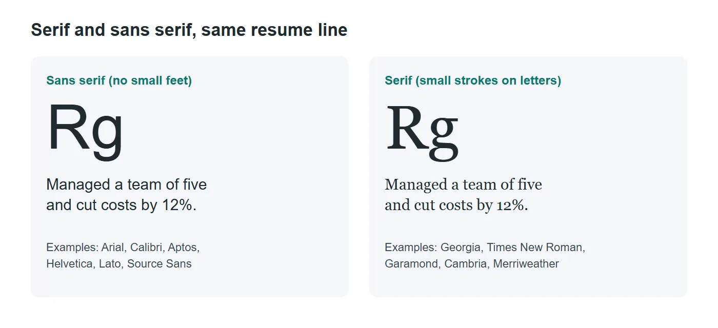
- Choose sans serif if most people will read your resume on a screen, if you work in tech, startups, marketing, retail or operations, or if you simply want the most neutral option.
- Choose serif if you work in law, publishing, academia or a traditional field, or if your resume is text-heavy and a classic look suits it.
- Mixing is fine if you keep it to two fonts: a serif for your name and headings with a sans serif for body text, or the reverse. More than two looks messy.
Here is a contrarian point worth knowing. Typographer Matthew Butterick, in his widely read guide Practical Typography, argues against the habit of setting every resume in a system font, and notes he still sees "an astonishing number of design résumés set in system fonts." He has a point for designers, whose resume is itself a portfolio piece. For most other jobs, a safe system font is fine, because the reader is judging content, not typography. Know which situation you are in.
Resume font size: what size to use
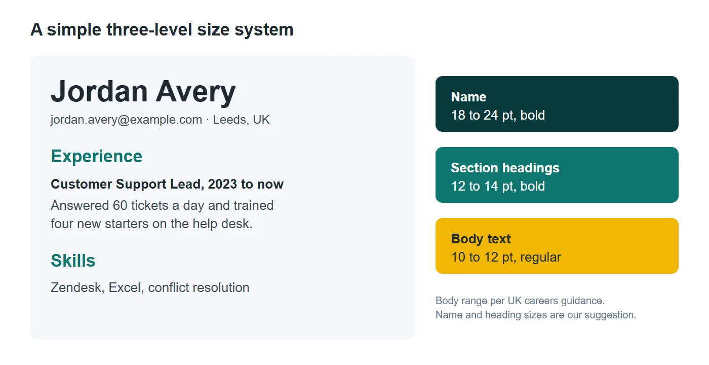
Size is where most resumes go wrong, more often than the resume font itself, usually by shrinking text to squeeze everything onto one page. Both UK services quoted above put body text at 10 to 12 points or at least 11. We suggest a simple three-level system that keeps everything readable.
| Element | Suggested size | Weight | Note |
|---|---|---|---|
| Your name | 18 to 24 pt | Bold | The largest text on the page, and only once |
| Section headings | 12 to 14 pt | Bold | Same size and style for every heading |
| Job titles and employers | Body size | Bold | Use weight, not a bigger size, to stand out |
| Body text and bullets | 10 to 12 pt | Regular | 11 pt is a safe middle for most fonts |
| Dates and locations | Body size or 1 pt smaller | Regular | Never below 9 pt |
The body range comes from the careers guidance above. The name and heading sizes are our own recommendation, based on keeping a clear hierarchy without wasting space. Also note that fonts at the same point size are not the same visual size. Calibri at 11 pt looks smaller than Arial at 11 pt, so print one page and check it at arm's length before you decide.
What if your content will not fit at 10 pt? Cut words, not size. Butterick puts it bluntly: "Unless a potential employer demands one page, feel free to make your résumé longer, if necessary." A two-page resume in readable type beats a one-page resume that needs a magnifying glass. UK careers guidance already allows up to two A4 pages for a CV, as our CV format guide explains. If you are unsure which document you need, see resume vs CV.
Do fonts affect ATS? What actually breaks parsing
An applicant tracking system (ATS) is the software many employers use to collect applications and pull your details into a searchable profile. Plenty of articles claim certain fonts "fail the ATS." The vendor documentation we checked does not say that. What it does list are layout and formatting problems.
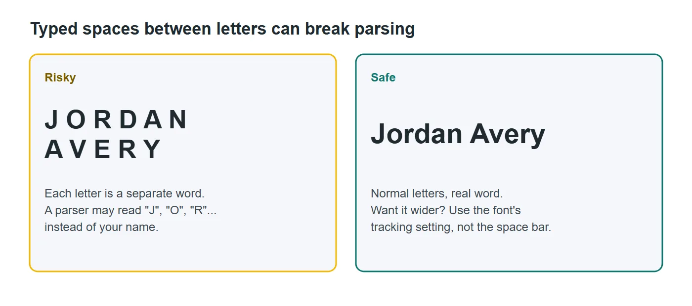
Greenhouse, a widely used ATS, publishes the causes of an unsuccessful resume parse. Among them: "a resume with spaces between the letters," "resumes that include graphics, photos, or word art," "resumes that have a columned layout," and resumes "uploaded as an image, rather than a document." Notice that the first item is a typography habit, not a font.
So the practical rules are:
- Never fake letter spacing with the space bar. If you want a wider name, use the font's character spacing setting, or just bold it.
- Avoid decorative or icon fonts for anything that carries information, such as your phone number or skills.
- Keep the text as real text. A resume exported as an image, or pasted as a picture inside a PDF, cannot be read at all.
- Stay in a single column for the main content. Greenhouse lists columned layouts as a risk, regardless of the font.
Our ATS-friendly resume guide goes deeper on structure, and the Harvard-style resume template is a good example of a simple, single-column layout that parses cleanly.
Line spacing, margins and consistency
Font choice gets the attention, but spacing is what makes a page feel calm or cramped. Harvard's career office talks about "balancing white space" and asks you to "use consistent spacing, underlining, italics, bold, and capitalization for emphasis" in its resume guide. Prospects suggests margins of about 2.5 centimetres all the way around, which is close to one inch.
Our working settings for a readable page are:
- Line spacing of about 1.15 for body text, so lines do not touch.
- Extra space before each section heading, roughly one blank line, so sections are easy to find.
- Margins of 2 to 2.5 cm (about 0.75 to 1 inch). Going below 1.5 cm makes printing risky and the page feel crowded.
- One emphasis style per job. Bold for job titles, regular for everything else. Skip underlining, which looks like a link on screen.
- The same font in your cover letter. Harvard recommends that your resume and cover letter use "the same font type and size," which makes the pair look like a set.
Consistency is the real professional signal. A reader forgives a plain font immediately but notices at once when one job title is bold and the next is not.
Fonts to avoid, and when cool resume fonts are fine
Some typefaces simply do not belong on a resume. Avoid script and handwriting fonts, novelty display fonts, very thin or light weights that fade when printed, condensed fonts set too small, and monospaced fonts such as Courier unless you are deliberately imitating a typewriter. Comic Sans is the classic warning, but any font that makes the reader notice the font before the words is a problem.
What about cool resume fonts for creative roles? If you are a designer, an art director or anyone whose taste is part of the job, a distinctive but readable font can help, as long as the body text stays simple. A common approach is a characterful font for your name and headings, and a plain, well-spaced font for everything else. Even then, check the PDF by selecting and copying the text. If copying produces gibberish, the font will cause the same problem for a parser.
Test in ten seconds: open your exported PDF, press select all, copy, and paste into a plain text editor. If your name, email and job titles come out correctly and in order, your font and layout are doing their job.
Before you export, also check that your font supports every character you need, such as accents in names, place names or language skills. A font that silently swaps "é" for a box is worse than a plain one that renders it correctly.
Save it as a PDF and run a final check
Your resume font only survives if the file preserves it. A PDF keeps your layout and fonts fixed, while a Word file can reflow on another computer if that font is not installed. Greenhouse's candidate FAQ says "upload a PDF for best results," and Harvard reminds applicants to "check that your formatting translates correctly" when converting.
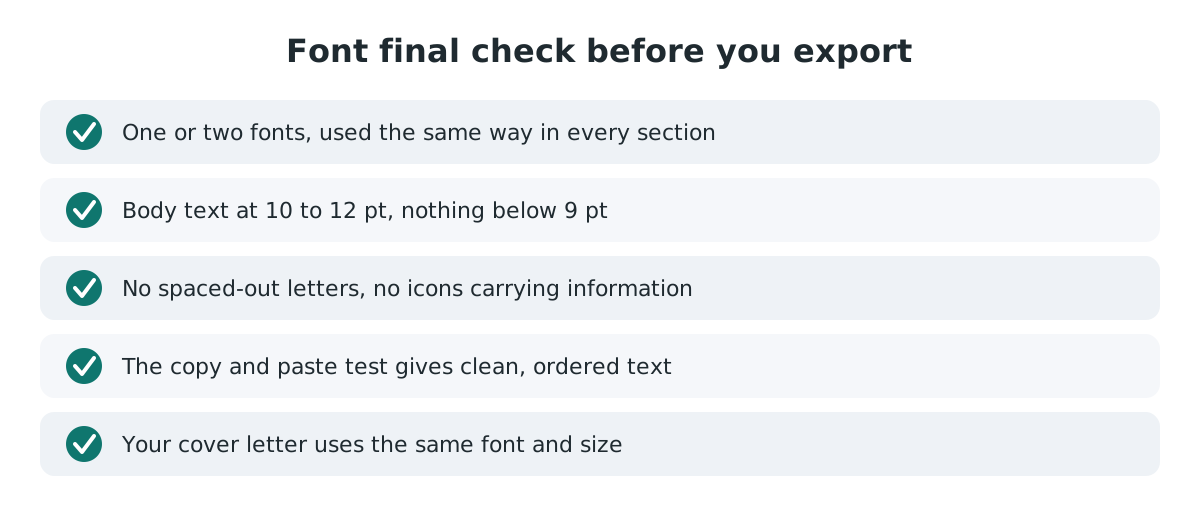
Before you send the file, check these points:
- One or two fonts in total, used the same way in every section.
- Body text at 10 to 12 pt and nothing below 9 pt.
- No spaced-out letters, no icons carrying information, no text inside images.
- The copy and paste test produces clean, ordered text.
- Your cover letter uses the same font and size.
If you would rather skip the settings entirely, our resume builder uses open-licence fonts, embeds them in the PDF and keeps the text selectable, with no sign-up and your data stored only in your browser. For UK or European applications, the CV maker does the same on A4 paper. You can browse every layout first in the resume templates or the CV templates.
Then make the pair match. Write your letter in the cover letter generator in the same style, and when the new job is yours, the resignation letter tool uses the same clean formatting. For the content that goes inside all this typography, read our guides to resume skills and hobbies on a resume, and the full walkthrough on how to write a resume.
Frequently asked questions
What is the best font for a resume?
A clean, common font such as Calibri, Aptos, Arial, Georgia or Times New Roman, or a free Google font like Lato or Source Sans 3. Prospects and the National Careers Service both recommend Arial, Calibri or Times New Roman.
What font size should a resume be?
Body text at 10 to 12 points, as Prospects recommends, with 11 pt a safe middle. Section headings at 12 to 14 pt and your name at 18 to 24 pt keep a clear hierarchy. Avoid anything below 9 pt.
Is Times New Roman okay for a resume?
Yes, it is readable and widely accepted. It can look a little dated because Word replaced it as the default font with Calibri in Office 2007, so Calibri, Aptos or Georgia are quiet alternatives if you want a more current look.
Should a resume use a serif or sans serif font?
Either works. Sans serif suits screen reading and modern sectors, while serif suits law, academia and publishing. If you combine them, use no more than two fonts.
Can a font make my resume fail an ATS?
The parsing problems Greenhouse documents are about formatting rather than typefaces: spaces between letters, graphics or word art, columned layouts and resumes uploaded as images. Use real text, a single column and a normal font.
What is the best font for a CV?
The same fonts work for a CV as for a resume. UK guidance from the National Careers Service suggests Arial, Times New Roman or Calibri at size 11 or bigger.
Should my cover letter use the same font as my resume?
Yes. Harvard's career office recommends preparing your resume and cover letter with the same font type and size so they read as a matching set.
Sources
- Prospects: How to write a CV
- National Careers Service (GOV.UK): How to write a CV
- Harvard FAS Mignone Center for Career Success: Create a strong resume
- Greenhouse Support: Unsuccessful resume parse
- Greenhouse Support: MyGreenhouse FAQ for candidates
- Wikipedia: Calibri
- Wikipedia: Aptos (typeface)
- Google Fonts: Frequently asked questions
- Matthew Butterick, Practical Typography: Resumes